1/16 | Laney's Nursery Tour
Designing my daughter's nursery has been my favorite design project to date. I'm not sure if it's because she has a small cozy room, or because the whole time I was doing it I was also dreaming about the day I would rock her to sleep in it, or if it's because it felt like my first nursery design, since we moved into our house weeks before my son was born —which meant throwing a bunch of stuff in a room and calling a nursery.
Here is a picture of what her room looked like when we first moved in. This mustard color with a floral border was in quite a few rooms of our house and is.....not my favorite.
I was asked a lot what the theme for Laney's room was going to be, and while I guess you could say "cactus themed" because of the statement wall, I typically don't like giving rooms a theme. For me personally, it is a design handicap. I tend to get too caught up in sticking with that theme and it always feels like it limits what I can do with the room. Instead, I like to find one or two bigger things that I love and then kinda work off of that.
For Laney's room I knew that I wanted some sort of statement wall behind her crib. I wanted her room to feel whimsical and peaceful without it being too baby or girly focused. I originally found a cactus wallpaper that I planned to do, but when I priced it out, it was going to be over $200 just for that one wall.
So then I started looking online for tutorials on making your own statement wall. I looked into making my own wallpaper, using a stamp, and then eventually landed on this tutorial from A Beautiful Mess on making your own cactus stencil. I loved this idea so much that I not only used it in Laney's room, but also at Flatland's Coffee.
The post from A Beautiful Mess and the wall I did at the shop are both gold, but for Laney's room I decided to do two shades of green to bring in some color. The tutorial uses a paint sharpie, but since I deviated and wanted color I couldn't find the color I wanted in a paint marker, so I just used permanent marker.
If you've seen my house, you know my obsession with white walls and black detail. I specifically wanted to challenge myself to bring in more color in this room, so if you notice, I used almost no black except the details in the rug. In all reality, pretty much the only color is the cactus wall and her crib and changing pad sheets, but for me-that's a lot of color.
I also like to keep things pretty minimalistic in most rooms. I chose furniture that had a soft beauty to it. It's so weird and fun-but I feel like that's exactly what I see in my girl so far. She is so incredibly beautiful, and has this soft and sweet personality.
The mirror above her dresser holds a sweet spot in my heart because it was a gift from my husband on our wedding day. I hadn't found a spot for it that I loved since moving into our home, but I love it in her room.
The bassinet changer started out in a base beside our bed before we moved her to her room. Although I didn't originally intend for it to be her changing station, I think I actually like it better for this purpose.
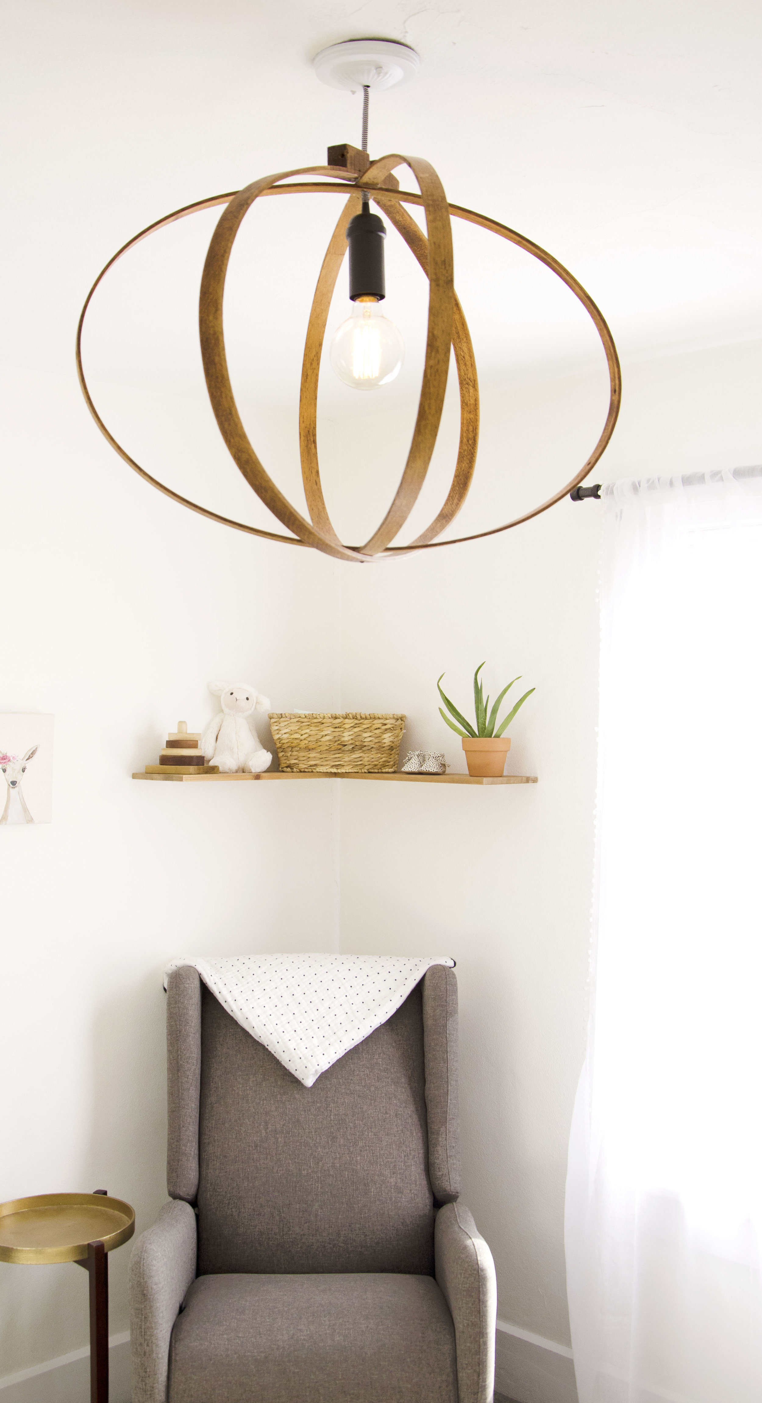
THE LIGHT-Can I just brag on my husband, Ben for a second? We found the wood piece at antique shop a couple years ago and he made it into a light! It's huge for such a small room, but I absolutely adore it. It's a statement piece for sure and I love that it's one of a kind.
Her rug was a treasure find from target. It was my sneaky way of bringing just a tad bit of black in, while also breaking up the carpet in her room.
Laney's nursery is my favorite room in our house. Probably because currently it's the only room I have actually finished designing. Which is one benefit to starting a blog-it has lit a fire under me to keep working on rooms! Thanks for being involved in the process.
xoxo - Cass


